Map Skills Key Words
-
Ordnance Survey is the national mapping agency for Great Britain. The maps they produce are ideal for planning walking expeditions.
-
A book that contains collections of maps and useful geographical information normally about the entire planet.
-
A digital system that uses satellites to pinpoint a persons location on the planet that is then represented as a point on a digital map.
-
The essentials expected to be on a basic map:
Scale
Title
Accurate
Compass
Key
-
A way of representing the actual size of a feature on a map. e.g. 1:25,000 would mean that every cm you measure on a map would be 25,000 cm in reality.
-
The words given to describe a map. The title is normally a description of the real world location being represented.
-
A map must be free from error and a true representation of the actual location.
-
The four main points of the compass are north, east, south and west.
-
4 additional points are added to the basic compass. these points are situated between the main points. They are a combination of the points they are between and always start with north or south. e.g. Between north and east is north east.
-
A section dedicated to understanding the map, the symbols used on the map and other more complex features.
-
A point on a map that is labeled with its height above sea level normally in meters.
-
Thin brown lines drawn on OS maps that connect points of the same height. Normally the height of the line is also written on it at some point. These are great at showing the relief of the land.
-
when sections of the same height on a map are shaded the same colour. Maps normally become darker the higher they get.
-
The physical shape of the land. Normally described with words like:
Steep
Flat
Valley
Hill
Mountain
-
Vertical lines that divide a map into section running from west to east. These are the first numbers you find when calculating a gird reference.
-
These are the horizontal lines that divide a map into sections from south to north. This is the second number you find when calculating grid references.
-
This is a combination of eastings and northings to give a collection of 4 number. These are then used to find sections on the map. These are written as follows:
0000
The first 2 digits are eastings, the 3rd and 4th digits are northings.
-
These are more detailed than 4 figure grid references. These are designed to help you find a specific location within the grid rather than just a general square.
6 figure grid references are made up of 6 digits the 1st and 2nd digits are the easting. The 3rd digit is an estimation of the distance between the next easting. The 4th and 5th digit are the northing, the 6th digit is an estimation of the distance between the next northing.
000000
-
An imaginary line that runs exactly half way between the north and south poles.
-
Imaginary lines around the Earth running parallel to the equator. These are measured in degrees north or south of the equator.
-
Imaginary lines around the Earth running from the north to the south pole. These are measured in degrees east or west of the Prime Meridian.
Start of Content

What is a Map?
A map is a visual representation of a location, area or section of a location, typically maps are displayed in a 2D format. Some digital maps attempt to include 3D elements to more accurately depict the real world.
Maps attempt to represent various things, like political boundaries, physical features, roads, topography, population, climates, natural resources and economic activities

4 & 8 Point Compass
A compass has 4 main points. In a clockwise direction, these are North East South and West. North does not mean forward or up! North should always indicate the direction of travel required to reach the north pole of our planet. If you can align your North arrow all other arrows should be correct.
A 4 point compass is not accurate enough to be very useful. An 8 point compass is normally the minimum used. An 8 point compass has 4 additional points equally spread between the 4 main points. They are named using the points they are between. e.g. Between North and East is North East.
East South and West North do not exist! The first word must be North or South.
A compass Is expected on every basic map.
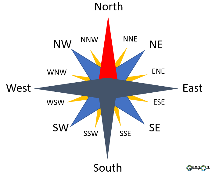
16 Point Compass
A 16 point compass is the ideal method of indicating direction. As you can see from the example there are an additional 8 points that fall in-between every point of an 8 point compass. The rule for calculating the name of the point on a 16 point compass is simple!
The first word is the name of the closest major point (one of the 4 main points) followed by the combined 8 point compass point.
For example:
Between East and North East = East North East
Continents

The world is made up of 7 continents. Flick between the two images and test yourself to see if you can remember them. Good luck!

Hints: 1 - Donald Trump lives here 2 - The largest rainforest on Earth is found here 3- Countries such as France and the UK 4- Made up of 54 countries 5- Home to China and Japan 6- sometimes referred to as down under 7- Has no permeant human population.
Oceans

The world has 5 major oceans. Remember that because we are a sphere the pacific is found on both sides of the map.

See what what you can remember. Hints: 1 - Wraps around our planet. 2 - Between America and Europe. 3 - It's cold up here. 4 - Named after a country. 5 - Named after a direction.
S.T.A.C.K

Scale - This can either be a bar or a ratio. This lets the person using the map know how how much smaller than the real world the map is. A scale of 1:50,000 means that every cm measured on the map would be 50,000cm in the real world. A scale bar is simple to use, you place a ruler along the bar and the distance it states give you your conversion.
Title - This should be a brief description or provide information of the area that is being represented through the map.
Accurate - This means that everything on the map must be an accurate representation of the real world location.
Compass - All maps must contain a compass so that the user can orientate themselves and calculate what direction they need to travel.
Key - This is a collection of useful information that the user can use to interpret the maps symbols and features.
4 Figure Grid References

The A B C of finding 4 figure grid references
Imagine you are trying to tell someone where to find the “G” on the grid. Follow the steps below to find out how you could give them 4 numbers that would lead them right to it!
A - You must always find the bottom left corner of the grid square that contains the feature you are looking for.
B - Then you need to identify the vertical line that meets the bottom left corner of the grid square. This gives you your first 2 digits. in this case.
0 3 _ _
C - Finally you need to identify the horizontal line that also meets the bottom left corner of the grid square. This gives you your final 2 digits. In this case they would be.
_ _ 0 4
Combine the 4 digits an you have a 4 figure grid reference.
G = 0304
6 Figure Grid References

The A B C of finding 6 figure grid references
Imagine you are trying to tell someone where to find the “G” on the grid. Well, it’s smaller this time, if you gave somebody the grid reference 0202 they could easily miss it! Follow the steps below to find out how you could give them 6 numbers that would lead them right to it!
A - Start by finding the 4 figure grid reference for the bottom left corner of the grid square, this time leave space for another number after each set of numbers.
0 2 _ 0 2 _
B - Next you need to imagine a grid within the big square, this should be a 10x10 grid. You then need to estimate how many small vertical lines across the “G” is. In this case the middle of the “G” is half way so it would be 5 small lines across. The vertical red line indicates this. This means your 3rd digit would be 5!
0 2 5 0 2 _
C - Finally you need to identify the small imaginary horizontal line that also passes through the middle of the “G”. In this case it is also half way across the large square so it would be approximately 5. This is also indicated by the horizontal red line. You them simply put your final digit on the end of your grid reference.
0 2 5 0 2 5
In a test setting you are allowed +/- 1 on the 3rd and 4th digit so all of the below would also be accepted.
0 2 6 0 2 5 0 2 6 0 2 6 0 2 5 0 2 6 0 2 5 0 2 4 0 2 4 0 2 4 0 2 6 0 2 4 etc…
Showing Relief on a Map
Contour lines

The image above is a cross section of a hill.
A contour is a line drawn on a map that joins points of the same height above sea level. The height between contour lines is usually 5 metres although it can sometimes be 10 metres. Contour lines are fantastic at representing the shape of land on a map, although they can be confusing to read. When Lines are close together this means the land in that area is steep, if lines are far apart this means the land is less steep.

The image above is what the cross sectioned hill on the left would look like on an OS map.
The hill has gradually sloping sides and is quite elliptical in shape this is shown by the contour lines being quite evenly spaced and the shape the lines create.
Layer Shading

Layer Shading is another method of representing height on a map. Normally the colours used start lighter at lower heights and become darker the higher the area they are representing. Layer shading does not represent a single value, instead it is used to show the height of land between two values. This can be seen on the above cross section.

As shown above, layer shading is also very good at representing the shape of land as the barriers between the colours act as a form of contour line. The smaller the distance it take to change colour the steeper the land is.
Spot Heights

The image above shows the same hill as shown for contour lines and layer shading from a side view.
Spot heights are individual points that are represented on maps as a point and are labeled with the height above sea level.

As you can see from the map view above, spot heights are great are giving the specific height of a point but are not very good at showing the shape or features of the land they are representing.
Normally a combination of all three methods of showing relief is the best option.
Latitude and Longitude

Latitude is a measure of how far north or south a point is from the Equator. Lines of latitude run parallel to the equator (horizontally) around the globe. Latitude is expressed in degrees either north or south based on which hemisphere the point is in. The maximum degrees latitude can be expressed in is 90° N/S.

Longitude is a measure of how far east or west of the Prime Meridian a point is. Lines of Longitude run vertically around the Earth and meet at the North and South Poles. Longitude is expressed in degrees either east or west dependent on the the direction of travel from the Prime Meridian. The maximum degrees longitude can be expressed in is 180° E and 179° W.

To give coordinates you need to combine both latitude and longitude measurements. First you give the latitude measurement followed by the longitude measurement.

A - 30°N 30°W . See if you can work out the others

How did you do? Remember if your point is on the equator or PM it will be 00°N/E
Map Projections
Eurocentric and Other Centric Maps
What are Eurocentric Maps?
Eurocentric maps are maps that place Europe at the center of the world, with other continents positioned around it. This type of map became popular during the Age of Exploration when Europeans dominated global trade and exploration. Many traditional world maps we see today are Eurocentric.
Why do Eurocentric Maps Exist?
Eurocentric maps exist because of historical factors. As European countries were the ones leading global exploration, they designed maps to reflect their central role in the world. This viewpoint influenced how the world was represented in books, schools, and even in political thinking for centuries.
What are Other Centric Maps?
Maps can also focus on other locations, like Africa, Asia, or the Americas, putting these areas at the center of the map. These maps offer a different perspective of the world and challenge the Eurocentric viewpoint. For example, maps centered on the Pacific Ocean show how the world might look if viewed from a Pacific or Australian perspective.
Why Do Different Centric Maps Exist?
These maps show that the way we view the world can change depending on where we are, who we are, and our historical experiences. They are important for understanding how power and perspective shape our world view.
What are Map Projections, and Why Do We Have Different Ones?
What are Map Projections?
A map projection is a way of turning the 3D surface of the Earth (which is a sphere) into a 2D map (a flat surface). Because the Earth is round, it's impossible to perfectly show its curved surface on a flat map. So, different map projections are used to display the world in different ways.
Why Do We Have Different Map Projections?
Each projection has different strengths and weaknesses, depending on what you want to show. For example:
Some projections focus on showing accurate shapes (useful for navigation).
Others try to preserve area (important for showing the true size of landmasses).
Some maps try to balance all these features, while others focus on one aspect like distance or shape.
Each map projection distorts certain aspects of the Earth’s surface, so the right projection depends on what you need the map to show.
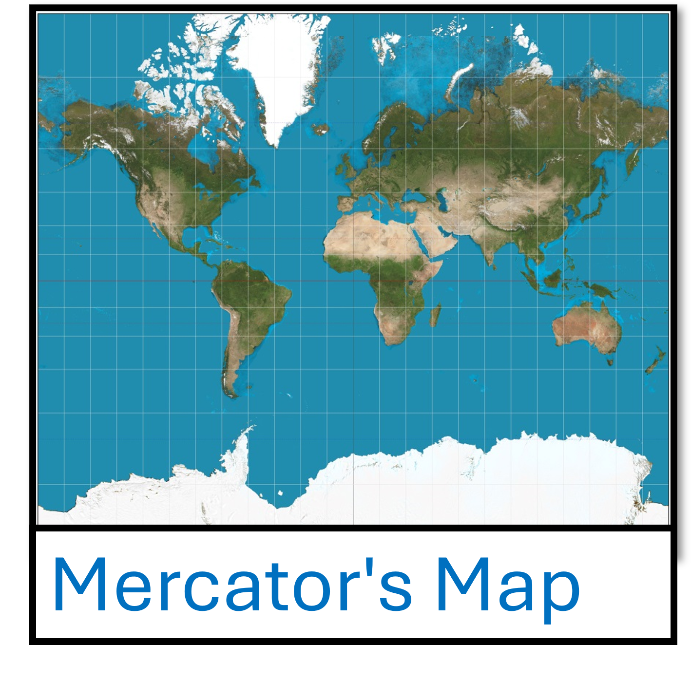
Mercator Projection
What is the Mercator Projection?
The Mercator projection, created by Gerardus Mercator in 1569, is a cylindrical map projection. It takes the Earth's spherical surface and stretches it out into a flat rectangle. This makes it easier to navigate, especially for sailors, because lines of latitude and longitude appear as straight lines.
Advantages of the Mercator Projection:
Good for navigation: Since latitude and longitude lines are straight, it is easy to plot a course, especially at sea.
Shape accuracy: Shapes near the equator are accurate, so countries close to the equator, like in Africa and South America, are represented with little distortion.
Disadvantages of the Mercator Projection:
Distortion at the poles: The further you move from the equator, the more distorted the map becomes. For example, Greenland and Antarctica appear much larger than they are in reality.
Size distortion: Landmasses like Africa appear much smaller compared to countries near the poles (e.g., Greenland looks much larger than it really is).
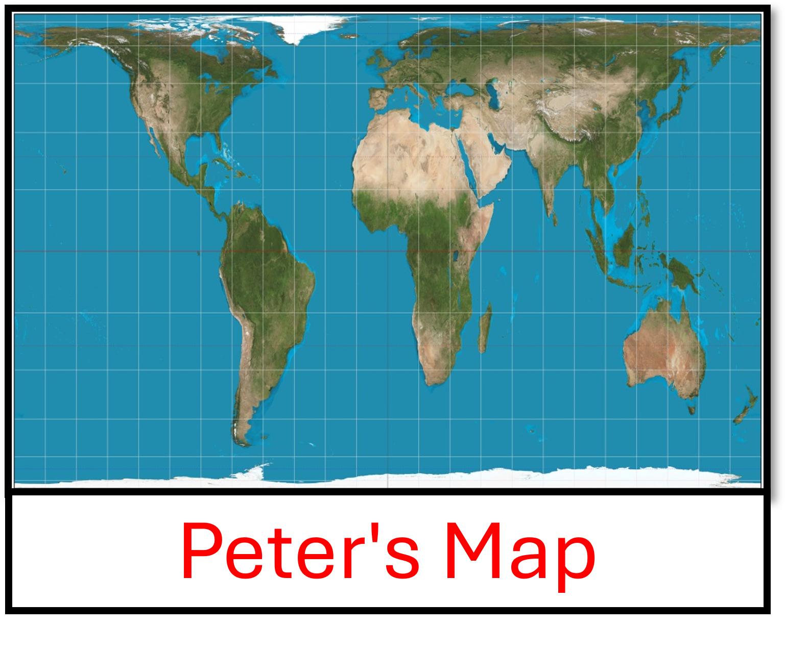
Peters Projection
What is the Peters Projection?
The Peters projection was created by Arno Peters in 1974 as an alternative to the Mercator projection. This projection focuses on showing the correct size of countries and continents, particularly in the Global South (like Africa and South America). The Peters projection uses a rectangular map, but instead of preserving shape, it keeps the relative sizes of areas more accurate.
Advantages of the Peters Projection:
Size accuracy: The main advantage is that it shows the true size of countries, especially those near the equator. For instance, Africa appears much larger and more accurately sized compared to the Mercator projection.
More balanced: It gives a better representation of the world by showing continents in their correct size proportions.
Disadvantages of the Peters Projection:
Shape distortion: The biggest downside is that shapes of countries are distorted. For example, countries near the poles look stretched horizontally, and those near the equator can appear too long vertically.
Unfamiliarity: The shape of the continents can be odd-looking and hard for some people to interpret, as it is so different from the traditional world map.